The entrance to the Children’s Section of the Cerritos Millenium Library in Cerritos, California is wonderful. You just know that magic awaits beyond these giant tomes!
 |
| (photo:Victor Rocha). ------------------ |
Bringing nature indoors. I like the spaciousness and feeling of height here. Very often the children;'s section comes with a feeling of close quarters and clutter. This is a proposed design for the children;s section of the State Library Complex at Kotturpuram in Chennai, Tamil Nadu, India.

---------
I love the use of colour and the simple lines and subtle ocean theme of this design. What a fun way to inject some whimsy in the library when the budget, and possibly the mindset of admin, won't allow for a revamp of the floor design.
 |
| photo found at http://www.behance.net/gallery/I-cue/2731857 |
-----------
Lots of colour and inviting - and movable- seating here. Also, I adore that the shelves are on wheels...perfect for those special events when you need to move things around. Or have a need to rearrange the library for a fresh look. I would like to see more creative looking lighting or something complementary to view on the ceiling.
| The Children's Library, Norfolk and Norwich Millennium Library |
----------
I like that this one has created a mini world to cater to the intended patrons. A town to play in, complete with it's own library. And after sitting and reading, sometimes you just need to go and play for a while. Luckily, there is a construction zone to make use of all that wonderful creativity.
 |
| photo found at http://anuaim.com/?p=308 |
------------
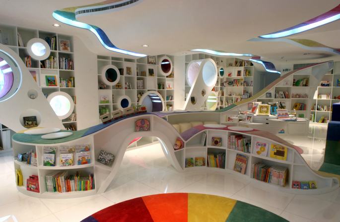
While this is actually a children's book store, I would like to adopt it for a library! What is more fun than being told to sit on the shelves?? Wonderful use of nooks & crannies to find that private reading spot. I like the flow of the lines, the creative incorporation of natural light and use of the colour wheel on both the shelves and carpet. Those higher shelves may be a bit problematic for younger users though. I wasn't able to find the exact location of this store, but the website I found it on stated it was in China.

http://testtest451.wordpress.com/2010/08/06/designer-childrens-book-store/


No comments:
Post a Comment